Table of Contents
Report Builder Tools
All Tools used on the front end of a report are described below.
Pointer

The pointer tool is used in place of the cursor while working on a report. To select data fields, Labels, or anything on a report you must have the pointer selected. When opening up a report the pointer is the default tool in use.
Label

Add a label to the report. This is used for titles and in some cases calculated values. To display a calculated field, you must have the “Calculated” field set to true in the Data section when Label is selected.
Important Properties
Appearance
- Align: Aligns text fields inside the box.
- BackColor: Changes the back color of the box
- Font: Changes the Font of the box
- ForeColor: Changes the font color of the box
- Format: Used when calculated is set to true; Formats the value/text inside the box
- WordWrap: Wraps the words to fit into the box
Border
- BorderColor: Changes the color of the border
- BorderStyle: Changes the style of the border. Transparent means no border.
- LineSlant:
- LineWidth: Changes the Width of the border
Data
- Calculated: When set to true, can build strings or put values into the label.
- HideDuplicates: When True, hides duplicate boxes created from each row.
- Text: When calculated is true you may put data into this and it will display, when it is false it will just display what is written.
Design
- Name: Sets the name of the chart.
- Visible: True/False. Sets the graph to be visible or invisible.
Image
This section is not used in DGS charting.
Layout
- Anchor: Top/Bottom/TopAndBottom. Used to anchor the graph to grow with another growing object.
- Height: Modifies the height of the graph on the builder.
- Top: Sets the top of the graphs location.
- Width: Sets the graph Width
Rectangle

Add a rectangle to the report. Useful for separating areas, and creating colored backgrounds over portions of a report (such as Totals section). This tool has the same properties as the Label tool.
Line

Add a Line to the report. Mostly used for spacing out sections and separation between fields.
Sub Report
Add a SubReport with its own properties and DataSource to embed into the main report.
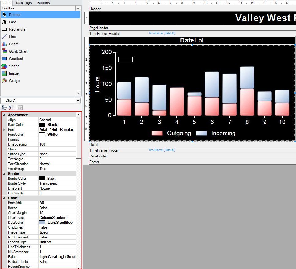
Chart

This button adds a chart to the report. The chart tool requires data to be organized in a way where there will be an independent and a dependent variable. In the example below, the ReadTime will be independent (X-axis), while the Value1 will be dependant (Y-Axis).
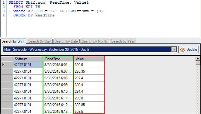
Once the data is set up and the chart is on the screen, clicking on the chart will reveal many properties
Important Properties
Appearance/Border
The appearance and border section are all related to how the graph will look style wise.
Chart
The chart section is an important section for the core of the graph.
- ChartMargin: Sets the margin of the chart on the inside of the box.
- ChartType: Used to set what style of graph it will be. (Line/Column/Bar/Area/Scatter/Pie/…)
- DataColor: Used to set what color the data will be.
- GridLines: True/False. Sets gridlines on the graph
- ImageType: JPEG/PNG/EMF. JPEG/PNG are generally higher quality than EMF
- LegendType: None/Left/Right/Top/Bottom. Sets the location of the legend.
- LineThickness: Used to set the thickness of the line on a line graph
- MixStartIndex: If there is a Y2 scale on the graph this determines which values go to the left and which values go to the right side.
- Palette: Colour List. Overrides DataColor above, and is nice for setting each line to different color: Red;Green;Blue)
- Shiny: True/False. Changes the style of the graph's data.
- ShowSymbols: True/False. hides/shows the points on the graph
Chart_ValueLbl
Chart Value labels are most useful for charts that need exact values displayed on them.
- ValueLabelShow: True/False. shows numbers at each datapoint
- ValueLabelOrdination: puts the labels about the line/bar
- ValueLabelTextColor: Changes the color of the labels
Chart_X
- AxisXLabel: Adds a label to the Bottom of the chart
- DataX: Column name for X-Axis (ReadTime)
- FormatX: hh:mm:ss tt (will show the time along the bottom axis, with times it will default to showing just days. If the Data is a varchar a data point for every value will be added, Numbers and dates will auto range)
- RotationXLbl: Rotates the labels on the X axis
- TickMajorLabelX: None/High/Low/NextToAxis. Places the X-axis values in the top, bottom, or under the X-axis.
- TickMajorX: None/Inside/Outside/Cross. Adds ticks to the graphs X-Axis
- XMax: Sets the maximum value on the X-Axis. Using -1 allows for auto-sizing.
- XMin: Sets the minimum value on the Y-Axis. Using -1 allows for auto-sizing.
Chart_Y
- AxisYLabel: Label for the left side of the chart
- DataY: Column name for Y-Axis (Value1). If using multiple values, separated by ;.
- FormatY: #,##0.0 - This would display value1 with one decimal point.
- RotationYLbl: Rotates the labels on the Y-Axis
- TickMajorLabelY: None/High/Low/NextToAxis
Chart_Y2
Chart_Y2 will use the second point of data in the dataY column. This is determined by the MixStartIndex feature.
- Y2AxisEnabled: Enables the Y2-Axis
- AxisYLabel2: Gives a label to the Y2 Section
- FormatY2: Gives the column numbers a format
- RotationY2Lbl: Rotates the Y2 Label around by X Degrees.
Data
This section is not used in DGS charting.
Design
- Name: Sets the name of the chart.
- Visible: True/False. Sets the graph to be visible or invisible.
Image
This section is not used in DGS charting.
Layout
- Anchor: Top/Bottom/TopAndBottom. Used to anchor the graph to grow with another growing object.
- Height: Modifies the height of the graph on the builder.
- Top: Sets the top of the graphs location.
- Width: Sets the graph Width
Gantt Chart

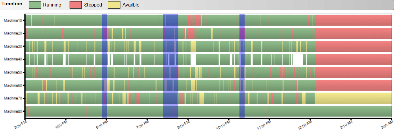
Add a Gantt chart to the report. A Gantt chart is the other style of chart DGS offers. This is most useful when used in correlation with downtime data for all machines.
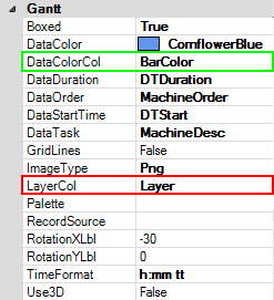
In the example below, this is how data will be organized in most cases when using the gantt chart. The DTDuration will be the data displayed, while the BarColor column and Layer column will be used for two useful properties.
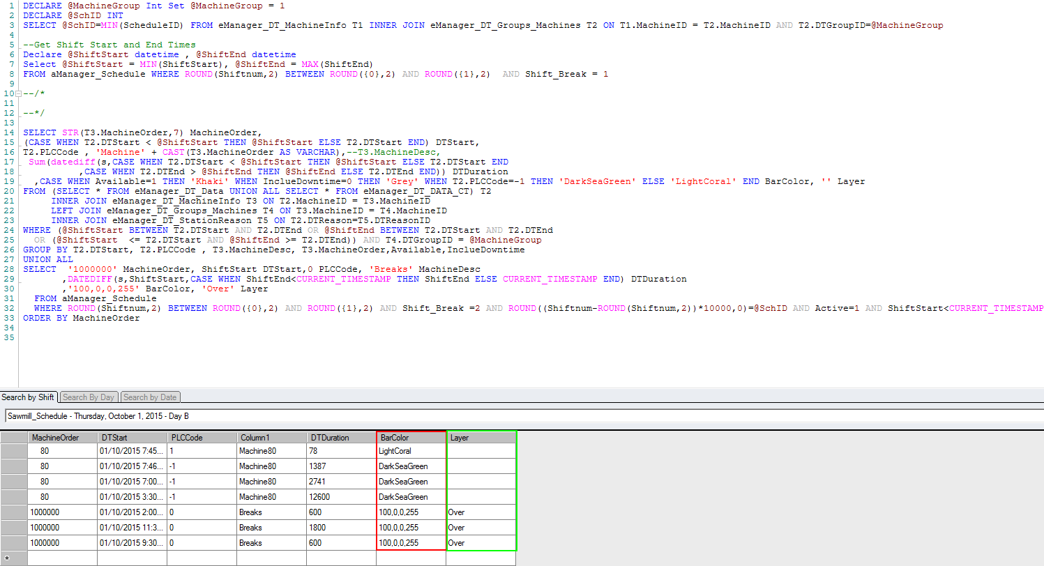
The DataColorCol allows the data to be displayed in multiple colors. This is based off of the BarColor column in the example below. The LayerCol Property allows for a layer above or beneath the chart that can represent site-wide data.
An example of both of these properties used on a graph looks like this. The blue overlay in this case represents breaks, while the changing colors of the data represents the activity/inactivity of the machines.
Important Properties
Appearance/Border
The appearance and border section are all related to how the graph will look style wise.
Data
This section is not used in DGS Gantt charts.
Design
- Name: Sets the name of the chart.
- Visible: True/False. Sets the graph to be visible or invisible.
Gantt
- Boxed: True/False. Makes the graph a box instead of two axis.
- DataColor: Changes the color of the graph data.
- DataColorCol: Dynamically changes the color of multiple sections of the graph. Examples of how it is used above.
- DataDuration: The data to be displayed on the chart.
- DataOrder: Orders the data along the y-axis.
- DataStartTime: Places the data along the graph relative to the x-axis.
- DataTask: Places labels along the Y-Axis of the graph
- GridLines: True/False; Shows Gridlines on the graph.
- ImageType: When using the layerCol data, set image type to Png.
- LayerCol: Adds layering over the data. Most useful for displaying data that affects all data points. Example of usage above.
- Palette: Changes the color of each bar of the graph.
- RotationXLbl: Rotates the labels about the X-axis.
- RotationYLbl: Rotates the labels about the Y-axis.
- TimeFormat: Formats the time labels on the X-axis.
Image
This section is not used in DGS Gantt charts.
Layout
- Anchor: Top/Bottom/TopAndBottom. Used to anchor the graph to grow with another growing object.
- Height: Modifies the height of the graph.
- Left: Modifies the location of the left of the graph.
- Top: Modifies the location of the top of the graph.
- Width: Modifies the Width of the graph.
Gradient

A gradient acts the exact same as a rectangle or label, however it allows you to use a gradient in the “gradient” section.
Important Properties
Appearance/Border
The appearance and border section are all related to how the gradient will look style wise.
Data
- Calculated: When set to true, can build strings or put values into the label.
- HideDuplicates: When True, hides duplicate boxes created from each row.
- Text: When calculated is true you may put data into this and it will display, when it is false it will just display what is written.
Design
- Name: Sets the name of the chart.
- Visible: True/False. Sets the graph to be visible or invisible.
Gradient
- Angle: Angle in which the gradient colors across
- ColorFrom: Changes the initial color of the gradient
- ColorTo: Changes the color the gradient fades to.
Image
This section is not used in the DGS gradient section
Layout
- Anchor: Allows the section to grow with another growing section.
- Height: Modifies the height of gradient.
- Left: Modifies the left side of the graphs location.
- MarginBottom: Margin's the text field from the bottom.
- MarginLeft: Margin's the text field from the left.
- MarginRight: Margin's the text field from the right.
- MarginTop: Margin's the text field from the top.
- Top: Modifies the location of the top of the gradient.
- Width: Modifies the width of the gradient.
Shape

The shape tool is used for all shapes besides rectangles and squares.
Appearance/Border
The appearance and border section are all related to how the Shape will look style wise.
Data
- Calculated: When set to true, can build strings or put values into the label.
- HideDuplicates: When True, hides duplicate boxes created from each row.
- Text: When calculated is true you may put data into this and it will display, when it is false it will just display what is written.
Design
- Name: Sets the name of the chart.
- Visible: True/False. Sets the graph to be visible or invisible.
Image
This section is not used in the DGS Shape section
Layout
- Anchor: Allows the section to grow with another growing section.
- Height: Modifies the height of Shape.
- Left: Modifies the left side of the graphs location.
- MarginBottom: Margin's the text field from the bottom.
- MarginLeft: Margin's the text field from the left.
- MarginRight: Margin's the text field from the right.
- MarginTop: Margin's the text field from the top.
- Top: Modifies the location of the top of the Shape.
- Width: Modifies the width of the Shape.
Shape
- Angle: Modifies the angle of the gradient if there is one set.
- ColorBKColor1: Modifies the first color of the gradient.
- ColorBKColor2: Modifies the second color of the gradient.
- ColorOutline: Modifies the border color
- ColorShadow: Modifies the shadowColor
- EnableShadow: Enables the shadow on the shape.
- RoundedRectangleRadius: Changes the Edges of the rounded rectangle shape type to a specific degree.
- VWShapeType: Modifies the shape of the field.
Image

Adds an image to the report. Best used for logos and stylization. The properties of the images are very rarely used besides the Layout section to determine the images placement/size.
Gauge

Appearance/Border
- Properties will modify the number font style of the gauge.
Data
- Calculated: When set to true, can build strings or put values into the label.
- HideDuplicates: When True, hides duplicate gauges created from each row.
- Text: Sets the location of the triangle pointer.
Design
- Name: The Name of the selected gauge.
- Visible: Sets the visibility of the gauge.
Layout
- Anchor: Allows the section to grow with another growing section.
- Height: Modifies the height of the gauge.
- Left: Modifies the left side of the gauge location.
- MarginBottom: Margin's the text field from the bottom.
- MarginLeft: Margin's the text field from the left.
- MarginRight: Margin's the text field from the right.
- MarginTop: Margin's the text field from the top.
- Top: Modifies the location of the top of the gauge.
- Width: Modifies the width of the gauge.
Special
StarGauge
- AxisColor: Sets the color of the y-axis points.
- BarColor: Sets the color of the bar on the gauge. This will be overwritten by any range colors entered.
- LabelFormat: Modifies the data point format for the y-axis.
- MajorTick: Sets the position of the larger data points.
- MaxTick: Sets the Max value on the gauge.
- MinValue: Sets the starting value on the gauge.
- RangeColors: Modifies the colors of the different ranges on the gauge. ex(Red|Green|Yellow)
- Ranges: Modifies the range for each color on the gauge. ex(0,100|20,80|40,60)
- TriangleHeight: Sets the height of the triangle.
- TriangleWidth: Sets the width of the triangle.
- ValFormat: Modifies the label format on the triangle.
- ValueFontCOlor: